What are the modifications made to your image due to? The company has explained that the new design tries to adjust to the devices with which its consumers access the products.
Those responsible for Google have explained in their corporate blog that they took the logo and brand that were initially designed for the computer browser page, and that they updated it to be used in “a more interconnected environment and from multiple devices.”
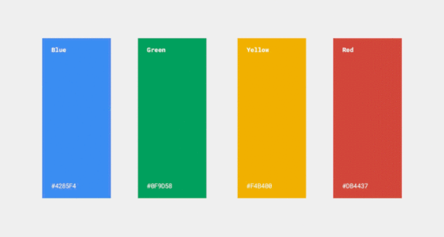
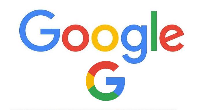
The serifs have been replaced: the end embellishments have been removed for simplicity. The new logo design includes a more compact version consisting of a single uppercase letter G with the four signature Google colors.
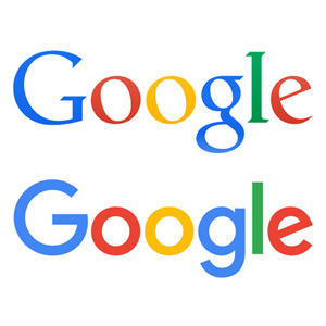
The new logo is characterized by cleanliness, simplicity, color and ease of use.
Do you like the new version of the logo? By the way, don’t miss the doodle that the company has designed for the renovation. 😉
