Changes in the business world are something of every day and the evolution of the visual identity framed in the logo is subject to various factors that identify a company. To understand a little better the reason for this strategy, here we explain 5 reasons to renew it.
Outdated or obsolete visual identity
Although a good corporate design should be timeless, there are times when its appearance requires modernization. More than a fashion issue, it represents an adaptation in tune with technological advances and an image that has lost its validity.
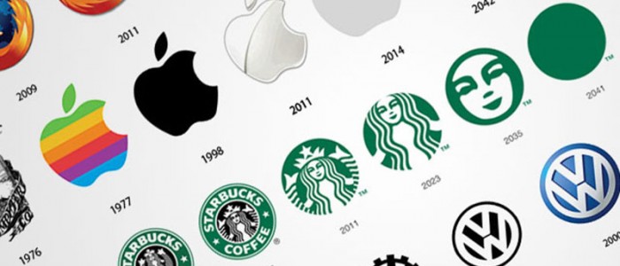
There are no studies that determine a relevant period and its change will depend on the quality of the design. While Pepsi and Coca-Cola have opted for 11 logos since their inception, an enduring example is the case of IBM, which has remained the same since 1956.

Renewal of products or services
Whether your logo is literal or descriptive, this view can often be altered. The corporate image must be consistent with your values, philosophy and qualities, but this does not have to be shown explicitly in the design that identifies your brand.
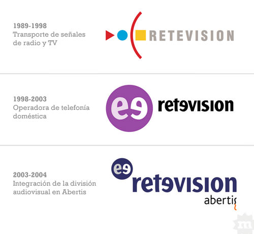
The transition to the broader positioning of a recognized brand can be seen in the telecommunications company Retevisión (from geometric figures to an integral design). Going from broadcasting radio and television signals to a telecommunications operator fueled its transformation.
Adaptation to design trends
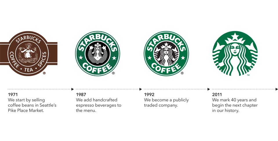
Currently, companies are betting that their visual identity generates more impact among their followers and potential clients. For this they make use of a more striking, simplified and little explanatory graphic design. In this sense, the Il Giornale Coffee brand passed to Starbucks Coffee and finally to Starbucks. We all know it and this synthesis continues to be synonymous with quality.
Change of perception in the audience
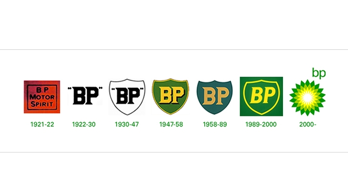
As a first contact or impression with clients, the name and logo can be transformed to offer a more appropriate image. This can be seen in the redesign of British Petroleum, which went from a shield to a more ecological symbol called Helios, which represents a yellow and green flower.
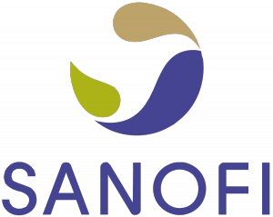
New name from strategic mergers
It is no longer uncommon to see multinational conglomerates merge to strengthen their position in the market. This integration leads to a new image that takes into account the qualities of the companies involved. This can be seen in the redesign of the famous pharmaceutical Sanofis Aventis.
Like these well-known redesigns of the visual identity there are many and they give an idea of how companies adapt to the evolution of the markets.
